
THANKSGIVING CLASSROOM
Print-Friendly Printables: How Teachers Save Ink Without Ugly Worksheets
The least expensive worksheet is not helpful if students cannot see the maze lines. When we plan print friendly classroom worksheets, we want to reduce unnecessary coverage while keeping the parts children actually use clear. That starts with the page design, then continues through print settings and the way a class set is assembled. You do not need a dramatic redesign of every resource. A small proof-print routine can help you avoid repeating an entire job because the text is faint, the margins are missing or the wrong pages were selected.
Teachers and classroom helpers · Grades K–5
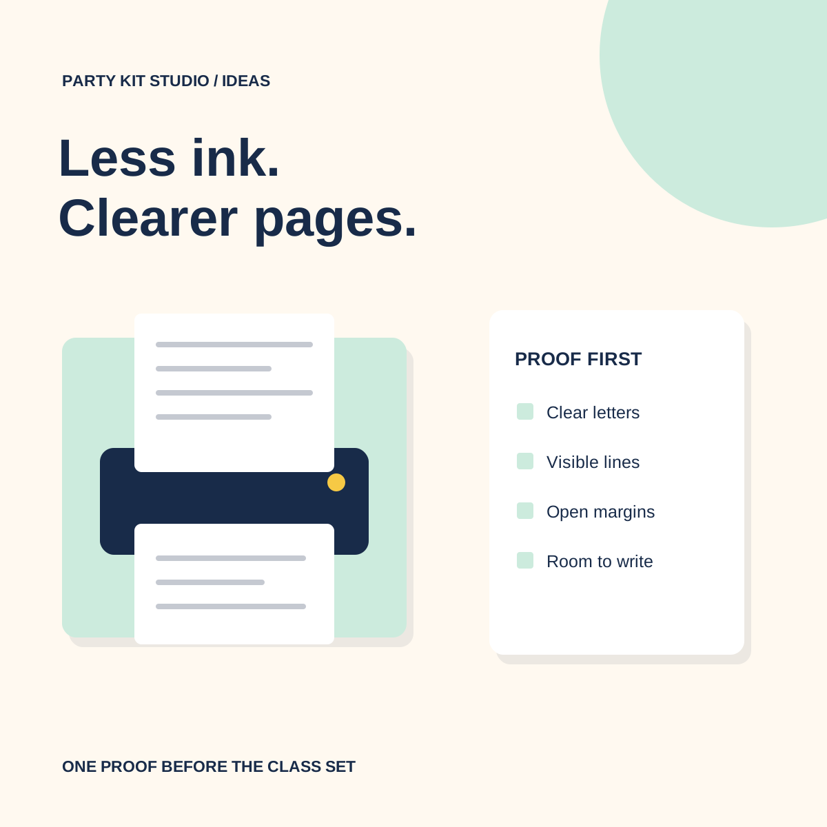
Choose white space before changing the printer settings
A white page background leaves the paper doing work that a large colored rectangle would otherwise do with ink or toner. Look for clear outlines, dark instruction text and decoration kept away from answer spaces. A few seasonal details can make a sheet inviting without turning the whole page into a colored surface. The useful question is whether each printed element helps children read, navigate or respond.
Converting a full-color page to grayscale does not remove its background. A large colored panel may become a large gray panel, and two different colors may become similar shades. We would choose an intentionally simple version of the design before trying to rescue a dense page through printer settings. Check that a child can still distinguish the route, grid or writing area without relying on color alone.
Our Thanksgiving Classroom Activities Printable includes a full low-ink edition of every page. Keep that version clearly labeled in your preparation folder so you can select it directly when making a class set.
Understand grayscale, monochrome and draft as separate choices
Grayscale describes an image made from shades of gray, but a setting with that name does not always mean only black ink is used. HP’s print-settings guide distinguishes high-quality grayscale from black-ink-only options on supported printers. Brother’s monochrome guidance similarly describes a Mono selection in the driver for its covered models. Menu names and available choices depend on the printer and software; use your school’s model guidance.
Print quality is another setting. A draft or economy mode may make a proof faster or lighter, but it is worth testing whether fine lines and small letters remain readable. Treat that as a trial, not an automatic setting for every page. If a word-search grid becomes faint, use normal quality for that sheet while keeping the simpler page design.
For a shared school printer, change settings for your own job where possible. Do not assume the previous user’s settings fit your paper size or color choice. Before sending the batch, read the print dialog one more time: destination, page range, copies, size, color mode and sides.
Proof the hardest page, then proof the real task
Choose a representative page with the smallest useful details: a word-search grid, a maze junction or a sheet of calling cards. Print one copy first. Look at it under the lighting students will use, at an ordinary desk distance. Check that the letters are distinct, lines are continuous and the edge of the activity is inside the printable area.
Then try the task. Follow part of the maze, circle a word and add a pencil response in a writing space. A page can look attractive at arm’s length while leaving too little room for actual work. Ask a colleague to check an unfamiliar instruction if you want another set of eyes. You are testing usability, not whether the page resembles the bright preview on a screen.
Keep puzzles at a usable size
Selecting two or four pages per sheet can reduce paper use, but it also reduces every letter, picture and answer space. That may work for teacher notes while making a student puzzle frustrating. We would keep bingo cards, mazes and writing pages at their intended size unless a test copy shows that the smaller version suits the particular students using it.
Check the document’s paper size against the loaded paper. Use the print preview to inspect all four edges. If fitting the page to the printable area changes its size slightly, check the result rather than assuming every PDF needs the same scaling choice. A cut-off direction or missing edge of a maze costs more preparation time than a careful preview.
Make photocopies from a clean master
Use a clean printed master without pencil marks, folds across the task or a dark edge from an uneven scan. Place it squarely on the copier and make one sample at the settings you intend to use. Look for pale lines that vanished and gray backgrounds that became muddy. If the sample is poor, return to the original PDF or master rather than repeatedly copying a copy.
Count different originals separately from the number of students. A bingo set with thirty unique cards needs each selected design once, not thirty copies of every design. A gratitude sheet used by thirty students may need thirty copies of that one page. Write the page range and copy count next to each item on your checklist before entering numbers at the machine.
Keep answer keys and teacher directions out of student bundles unless there is a reason to include them. Put a labeled master set in a folder for future use. When cutting is required, check the sample’s guides and margins before copying the whole stack.
Build only the set you will actually use
A download can contain more activities than one lesson needs. Select the pages that serve the plan, then add a small number of spares based on your class rather than printing the entire collection for every child. Put the pages in activity order before stapling anything. Some sheets are better loose because students need to turn them, share them or take them to a station.
We like a brief note attached to the finished master: chosen pages, paper size, quality setting, copies per original and any useful adjustment. That note makes the next session easier without promising a particular percentage of ink savings. Different printers and documents behave differently; a clear, usable class set is the result you can actually inspect.
Questions, answered.
Does black-and-white printing always use only black ink?
Not on every printer or setting. Check the options for your model; a high-quality grayscale mode may use color inks as well. The manufacturer references below explain the distinction.
Should every worksheet be printed in draft mode?
No. Test a page with fine details first. If lines or letters become faint, use a clearer quality setting and reduce decorative coverage in the design instead.